
- Forums
- Archives
- Archive
- General Discussion archive (read-only)
- General Discussion 1999-2009 archive (read-only)
- General Discussion archive 2007 (read-only)
You are using an out of date browser. It may not display this or other websites correctly.
You should upgrade or use an alternative browser.
You should upgrade or use an alternative browser.
Best Moz cover art?
- Thread starter ordinaryboy
- Start date


fuckfrankie
New Member
but YATQ and ROTT are both horrible,horrible covers
ROTT is sorta ugly, but YATQ really pisses me off. why is he holding the gun like that? it's got a pistol grip for a reason...and he should have a more menacing look on his mug. i'd swear they photo shopped that gun into the pic.
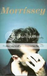
anyways, my fave:

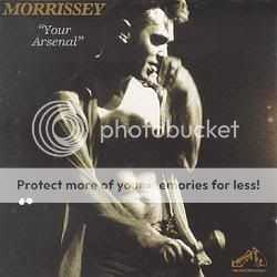
i'd have to agree that Your Arse is pretty nice too
")
bored
not bitter but bored
I've said it before on similar threads (is this Kewpie's day off?), but his best cover isn't an album cover at all:
If this doesn't sum up Morrissey perfectly, I don't know what does.

This is definitely the funniest.
As far as how he looks, my favourite is the Interesting Drug sleeve.
I love the way his hair is shaved.
PregnantForTheLastTime
Hideous trait.
I loved the Ringleader of the Tormentors sleeve and singles sleeves. I loved the whole package, the "refined European gentleman" image which carries all the way through to the polished finish of the songs. And I thought the attention to detail was terrific- loved the mock-classical sleeve from the first time I saw it.
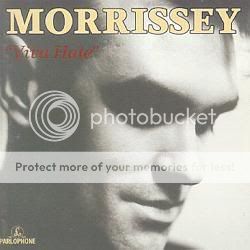
But it's not classic Moz. Hmmm... Viva Hate... it was such a smooth transition from Strangeways. That's my favorite.
He looks 10x hot on the Vauxhall sleeve but it looks like an R&B sleeve.
But it's not classic Moz. Hmmm... Viva Hate... it was such a smooth transition from Strangeways. That's my favorite.
He looks 10x hot on the Vauxhall sleeve but it looks like an R&B sleeve.
MsChievous
Hand Frink
"Your Arsenal". Then again, what do you expect from a frinker??

Claudia2006
Banned
...YATQ really pisses me off. why is he holding the gun like that? it's got a pistol grip for a reason...and he should have a more menacing look on his mug. i'd swear they photo shopped that gun into the pic.)
Heh... this weekend I bought one of those frames for an LP so you can hang it on the wall. I just now asked the husband to pick which one of my Moz records he'd rather look at every day and he immediately chose Quarry "b/c of the gun." He's not much of a fan, but he actually seemed to like the picture. He's into guns so I'm shocked he didn't criticize.
The other one that's going up on the wall as soon as I find a frame that fits a 45" single is this one:
nugz
SUPAHSTAR!
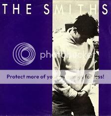
I always thought it was interesting how all the Smiths albums didnt have the band members pictures on them, but almost all of the solo Moz album covers had his face on them.
I actually REALLY like the Quarry cover. I dont know if its my fav though, i never really thought about it.
I actually REALLY like the Quarry cover. I dont know if its my fav though, i never really thought about it.
PregnantForTheLastTime
Hideous trait.
thewarroom
Scorpion Kicker
Gotta go with Vauxhall and I. Followed very closely by Kill Uncle.
--Just noticed that on the Arsenal cover he appears to be holding the microphone in a very interesting place...any thoughts?
As far as singles go, love the EILS cover, Redondo Beach, and Dagenham Dave (gotta love Terry Venables!)
--Just noticed that on the Arsenal cover he appears to be holding the microphone in a very interesting place...any thoughts?
As far as singles go, love the EILS cover, Redondo Beach, and Dagenham Dave (gotta love Terry Venables!)
I like this one

this was my favorite in high school. love it.
georgina
and after all this time
--Just noticed that on the Arsenal cover he appears to be holding the microphone in a very interesting place...any thoughts?
I bet there is an entire thread somewhere about where he's holding that microphone, and the thoughts are obvious
I like this one
I love that one, too.
imogen11
Junior Member
This one:

This gets my vote too. Great photo!
I'm also very partial to Kill Uncle (hot), Bona Drag (hot) and Your Arsenal (hot).
I also think ROTT is a great cover. In fact, I think it's the best thing about the album
It's just such a dramatic, Morrissey-esque image, and, combined with the title, I found it very amusing.CrystalGeezer
My secret's my enzyme.
But my my, whatever is he licking? It ain't yer arsenal, that's for sure!
It ain't yer arsenal, that's for sure!imogen11
Junior Member
Except the leading is wrong on the lines of text... I don't know exactly why it bugs me so much, the typography on the entire Quarry series of sleeves is like nails on a chalkboard to me.
Leading??
You must be a graphic designer! Only a designer would be driven to distraction by incorrect leading
Me too (well, I am still studying graphic design) and I too have picked apart this cover. hehe
Good photograph, but that's about it.
Similar threads
- Replies
- 2
- Views
- 796
- Replies
- 13
- Views
- 1K
D
- Replies
- 7
- Views
- 1K
D
- Poll
- Replies
- 26
- Views
- 8K
- Replies
- 28
- Views
- 2K
Share:
- Forums
- Archives
- Archive
- General Discussion archive (read-only)
- General Discussion 1999-2009 archive (read-only)
- General Discussion archive 2007 (read-only)