'The Smiths' '83/'84 'logo' typeface request

joe frady

Vile Refusenik
Hello,
I'm currently working on a design for a home-made Smiths t-shirt with an image that as soon as I saw it (him) thought 'that shoulda been a Smiths cover star'.
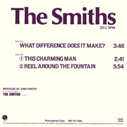
So I have the image, but I really need 'The Smiths' logo. For me the best Smiths logo was the one that appeared on the initial three singles and debut album. Examples here ~
1984_smiths_poster.jpg
1984_whatdiff12_promo_1.jpg
1983_handinglove_poster.jpg

Does anyone know the exact typeface, or, even better, could provide a nice, clean, juicy download of the logo?
Thank you in advance.
~ J:)E
 
Re: 'The Smiths' '83/'84 'logo' typeface request.

I would say the typeface is Optima Bold, almost for sure. (Or, at least, a lookalike of that anyway!) Seems to be one of those pay faces, though, so unless you're willing to dump $30 for your logo in high-res... But I'm trying to see if there're any sites that'll let me get it in high res, at least.
 
Last edited:
Re: 'The Smiths' '83/'84 'logo' typeface request.

If you're still having trouble at this point (the last two posts looked very helpful), try this.

Go into Photoshop, or a Photoshop-like program, and open up the highest resolution image you can find. Stretch the image to your desired size. At this point it'll look very pixely, but don't worry about that just yet. Create a new layer, and select the 'selection' tool. Trace over each letter until you have made a blank selection of each letter, then color it the desired color. Delete the original layer, and then you should have a perfect image of your size specifications.

I know that may have been confusing...message me if you need help.

Good luck :thumb:
 
Thank you all for your responses. I'm very grateful. I'll let you know how I get it on. If it works out right I'll post pics, etc. :)
 
Hi Joe the logo is just a typeface called 'Optima' and The Smiths logo is the bold version of the same face.
 
I'm using open office and my Optima does not look the same -

It is definitely similar (as others have said)

The 'S' is different - The 'h' has a longer stem on the record sleeves & also the 't' has a sloping top which isn't the same as the one I'm looking at on my 'pute.

I'd be cool to find the right one though!
 
can i just ask how you do a homemade t-shirt?
 
The easiest is by an iron-on transfer. Though I have a mate who does his own printing with light sensitive paint and also does screen printing.
 
So, I juxtaposed the original logo with the Optima Bold font to see the difference and here it is.

The logo in green is the original. The pink letters were done with Optima Bold. I had to adjust the space between the letters, which on the original is shorter than the default space on Optima. On Photoshop I set it to "-30". Obviously you would have to adjust each space individually.

smithsoptima.jpg
 
So, I juxtaposed the original logo with the Optima Bold font to see the difference and here it is.

The logo in green is the original. The pink letters were done with Optima Bold. I had to adjust the space between the letters, which on the original is shorter than the default space on Optima. On Photoshop I set it to "-30". Obviously you would have to adjust each space individually.

Font geek. :D
 
I love this place. Abundant thanks continued. :)
 
I wished I bought Peepholism when it first came out.
My favourite is the one on Meat Is Murder - Olivia Bold (I think).
I love fonts me!
 
Back
Top Bottom